ALL POSTS
The Crucial Role of Mobile-First Approach in Web Design: Ensuring Consistent User Experience
September 21, 2023
Thinking Beyond Desktop: The Illusion of Space
When embarking on a website design project, it’s easy to become thrilled by the spacious canvas provided by large desktop screens.
Designers and clients may see this as an opportunity to fill the space with an abundance of visual elements, intricate details, and feature-rich components. But this often comes to the detriment of the mobile experience.
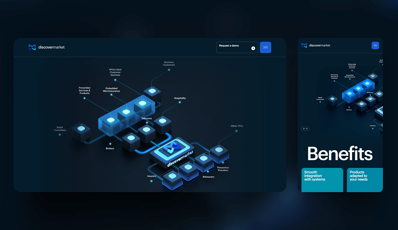
A complex infographic which poorly displays on mobile. Source: discovermarket.videinfra.com
Moving to a Smaller Room: Planning Ahead to Avoid Trade-offs
Picture yourself moving from a spacious 3-bedroom apartment to a compact 1-bedroom unit, where everything must fit within a smaller area.
You could employ clever solutions like collapsible furniture, but you still need to retain all the amenities you had before. Several scenarios could unfold in this situation:
- Play Tetris, but attempting to cram all your belongings into the limited space makes it challenging to move around or use any equipment effectively.
- Make some trade-offs: Do you really need a dryer? Is a queen-sized bed necessary when you’re single? Can you do with a smaller fridge since you frequently order takeout? Translating this analogy to web design: it’s unfortunate to invest significant time and resources into developing a complex section or feature that ultimately ends up being hidden on mobile devices.
- Alternatively, if you planned for the move from the beginning, you chose to keep things minimal in your larger apartment. So, everything fits perfectly in your new space, and you can enjoy the same experience and amenities. This is where the importance of considering mobile devices from the outset becomes evident.
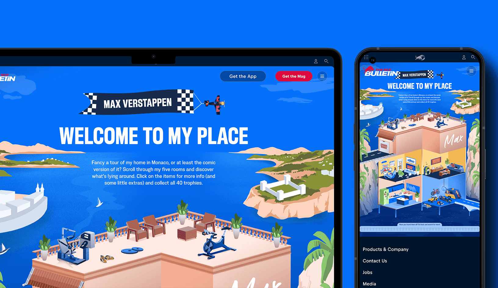
A desktop-first experience which doesn’t have enough room on mobile. Source: redbull.com
Bridging the Gap: Consistency and Prioritization
It’s crucial to recognize that the user experience on a large desktop screen vastly differs from that on a small, vertically-oriented touch-based screen.
What may appear visually appealing and interactive on a 27″ desktop monitor with a precise cursor or smooth scrolling and dragging abilities, may become nearly impossible to navigate and interact with on a tiny mobile screen.
Therefore, it’s paramount for designers and clients to avoid being dazzled by the extent of desktop design possibilities alone. By thinking about mobile devices during the initial stages of the design process, you can ensure that the website’s layout, content, and interactions are optimized for a smaller form factor. This approach enables strategic decision-making to prioritize essential elements and features, simplifying the design, and enhancing the overall user experience across devices.
The Foundation to UX Success
Just as planning ahead when moving to a smaller space allows for a smooth transition, prioritizing mobile design from the start sets the foundation for a successful website that meets the needs of all users.

